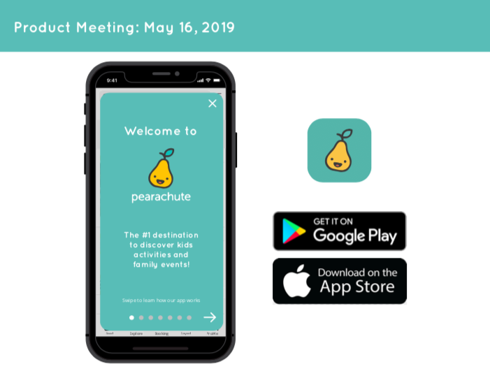
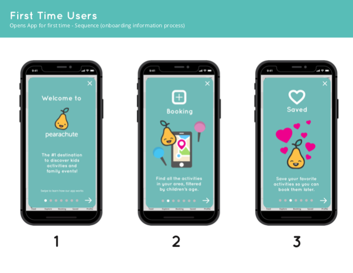
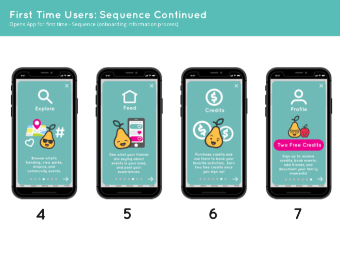
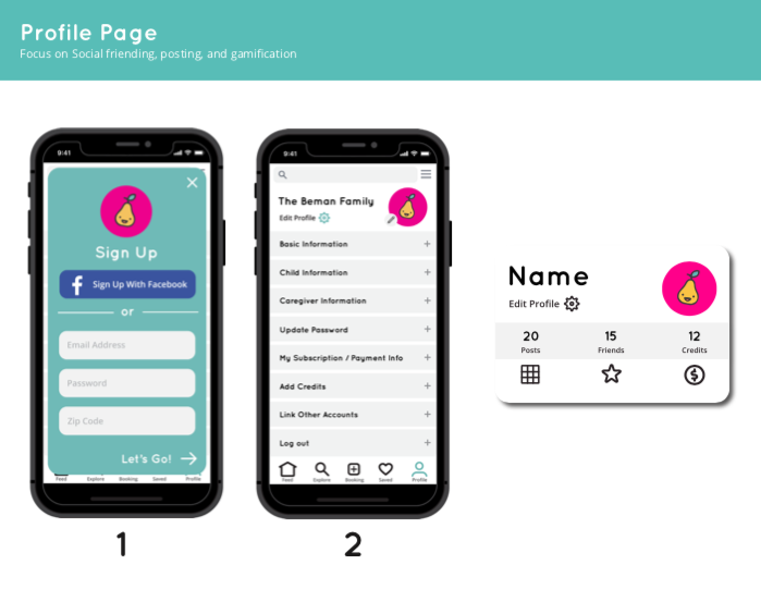
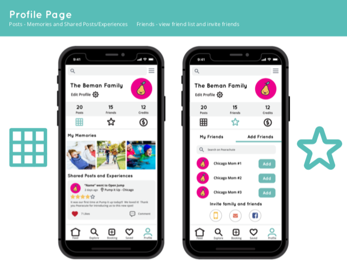
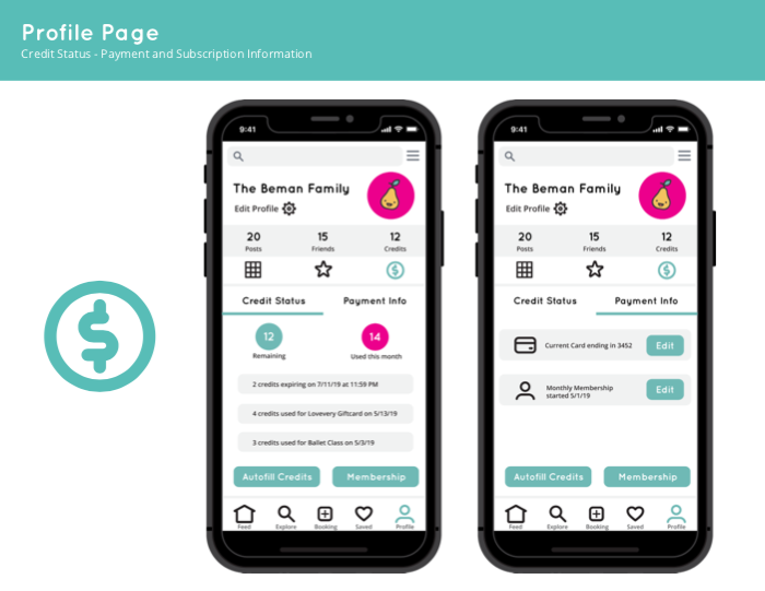
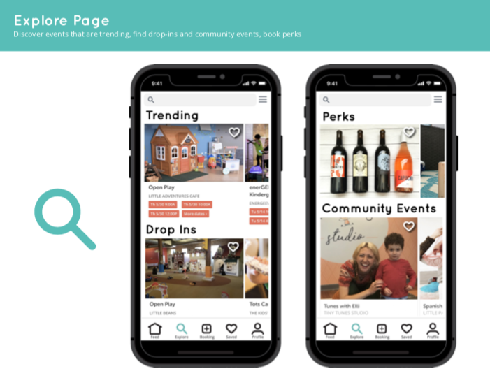
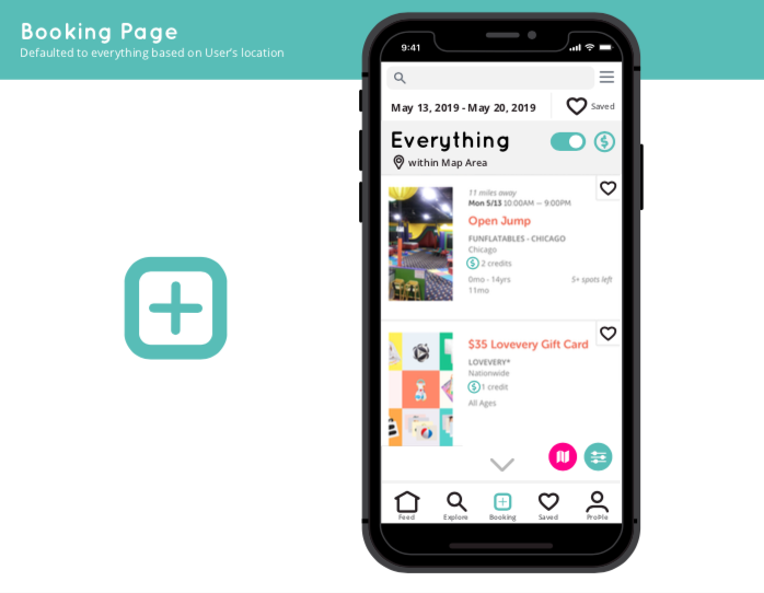
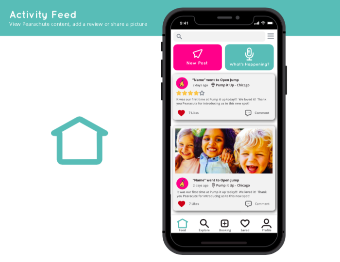
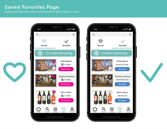
This week, prior to our product meeting, I created a Mobile App Ui Design Proposal. My proposal focuses on helping us efficiently and conceptually work through product improvements.
I created a notion board in our Product Roadmap section and shared my design proposal with the entire Pearachute team. It is important to learn out loud. When you share with your co-workers, they get a sense of your skills and capabilities. Also, you will get constructive feedback on how you can improve your work. Therefore, I thought it was important to share my proposal with everyone on the Pearachute team.
Conceptual Design
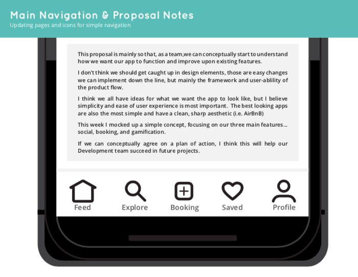
This proposal is mainly so that, as a team, we can conceptually start to understand how we want our app to function and improve upon existing features.
I don’t think we should get caught up in design elements, those are easy changes we can implement down the line, but mainly the framework and user-ablility of the product flow.
I think we all have ideas for what we want the app to look like, but I believe simplicity and ease of user experience is most important. The best looking apps are also the most simple and have a clean, sharp aesthetic! (i.e. AirBnB)
This week I mocked up a simple concept, focusing on our three main features…social, booking events, and gamification. The social aspect of creating a profile and interacting with other families in your community is important to get our registered users to continue to use the app. With higher retention of registered users, there is a larger chance of them booking a course and purchasing credits.
If we can conceptually agree on a plan of action, I think this will help our Development team succeed in future projects and move the needle! Scroll down further to see my Ui Design and mockups.
Pearachute Mobile App Ui Design Proposal
